December 17, 2008
Museum Architecture on NPR
NPR has an excellent story on museum architecture. It features two buildings by Daniel Libeskind, the Denver Art Museum and San Francisco's Contemporary Jewish Museum.
December 11, 2008
Copia museum closes

The Copia museum in Napa Valley has filed for bankruptcy, mostly because they have $70 million in bonds to pay off and only about a third of the attendance that they had projected. If you are a glutton for punishment, here is another more detailed analysis of the finances and specific issues.
Sorry for all the bad news. On a happier note, it looks like the Mark Twain House will pull through after national publicity about their overly-optimistic projections and cost overruns on their new building. Here is an update. I spoke with someone familiar with their situation yesterday and it looks like the publicity has helped them to attract additional support.
November 18, 2008
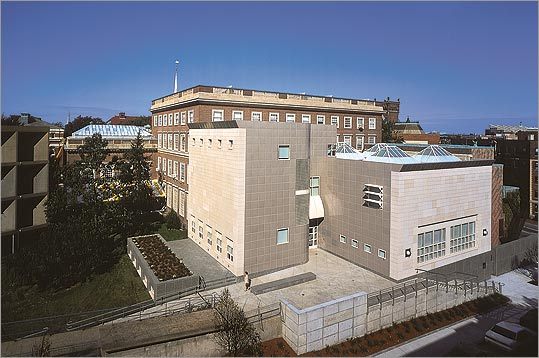
The Decordova Museum

I've long wanted to visit the Decordova Museum in Lincoln, Massachusetts (just outside Boston) and never quite got around to it. I'll be back. It was delightful.
Set on the former Decordova estate, the museum is both a sculpture park and a regional contemporary art venue. A wide variety of modern sculpture is everywhere throughout the grounds and invites visitors to explore. The gallery spaces are housed in the mansion house, which sits atop a steep hill at the center of the site, and a modern addition with additional gallery spaces.
 Most interesting from an architectural perspective is the way the architects of the 20,000 SF addition, Kallmann McKinnell & Wood of Boston, connected the mansion house to the parking below. The expansion succeeds because it is sensitive to the site. The entrance is understated but easy to find, the circulation is obvious–a brightly-lit stair open to the landscape, and the galleries provide a variety of larger and small spaces, well suited to the contemporary art on display. The building is nicely detailed, but restrained. It compliments the art, the sculpture, and the landscape, rather than competing for your attention in a place that already has plenty of other attractions.
November 2, 2008
WSJ on Museums and the "new" economy
The Wall Street Journal has a very good analysis of the effect of our current economic problems on art museums, particularly on building projects. A few quotes:
Good stuff all around.
- Pressure to expand museums comes from shortsighted donors with an "edifice complex," says Scott Black, a trustee of the Boston Museum of Fine Arts and chairman of Delphi Capital Management.
- . . . museum directors say they are actually potentially much more nimble than the cash-strapped orchestra or local theater might be because they have such diverse sources of revenue -- membership income, facilities rental, donations, endowment, admissions and gift-shop sales.
- The Parrish . . . museum will not break ground until 80% of the target amount is reached through donations. "A decision was made not to take a mortgage" to raise the financing, she says, and now she's glad there isn't one.
- Meanwhile, the High Museum's Michael Shapiro is thinking far in the future. "We're putting a lot of energy into planned giving, into bequests," he says. In the meantime, the High's annual wine auction is coming in March, and the museum is beefing it up and hoping for record results. People may want to drink more wine in a recession, the director says.
Good stuff all around.
July 1, 2008
"The Perils of Museum Design"
The Boston Globe has a good piece entitled "The Perils of Museum Design" on the vapor barrier problems at Harvard's Otto Hall, home to the Busch Reisinger Museum. Otto Hall is slated to be torn down to make way for a new Renzo Piano addition to the adjacent Fogg Museum.
Otto Hall was built in 1991 with state-of-the-art temperature and humidity control systems. Unfortunately, this was before architects and engineers fully understood how to keep escaping humidity from damaging the building envelope. Apparently the damage to the building was bad enough that it might have been torn down even without the Fogg expansion. Unfortunately, this kind of problem still happens with newly built museums, but seldom makes the national news.
A relatively good discussion of wall systems can be found in this educational piece for an air barrier company.
Update: Sadly, these links are out of date. Here are several other interesting discussions:
The Nothern States Conservation Center on Relative Humidity and Temperature
A piece posted by the National Archives by the father of this discussion, Ernest Conrad: The Realistic Preservation Environment
And here is a good, if technical, discussion of the challenge of Humidity Control in the Humid South.
June 26, 2008
Nelson-Atkins Attendance Up
 Some good news (and some refreshingly direct discussion) about attendance at the Nelson-Atkins Museum in Kansas City with its new Stephen Holl-designed addition to in this article in the Kansas City Star.
Attendance is up significantly, although not as much as they had hoped, and unlike the Denver Art Museum (article and interview) and the Milwaukee Art Museum (article) both of which found themselves in financial hot water after their expansions, the Nelson-Atkins seems cautiously optimistic about its future attendance.
Aside: I'll see the new building ths summer, but in the meantime loved this quote about it from the director in a NY Times article:
“It’s distinctive like an icon, but not one of those self-satisfied exhibitionist buildings that beg for applause.”I hope it lives up to this.
June 24, 2008
Musée du Quai Branly, Paris
When the Musée du Quai Branly first opened two years ago, it generated a great deal of controversy (here in the NY Times, here in the London Review of Books, and here in a piece by an obsequious Nicolai Ouroussoff in the Herald Tribune). The primary criticism was that the museum inappropriately decontextualized aboriginal art–unsuccessfully answering the old question of whether the objects on display are works of art or cultural artifacts.
In a way, the museum punts on this question (which is what Ouroussoff perversely likes about it) by creating a building which use earth tones and organic shapes to create a new "context" for the objects, which are spotlighted almost like exotic birds in a post-post-modern river and forest. I loved many of the objects--they are beautiful and beautifully lit (mostly). But I also had no idea which region I was in (Is this Oceania or Americas?), never did find the interpretive kiosks, was annoyed by the ever-so-long ramp to the exhibit level that offered neither artifacts nor interpretation, and couldn't find the exit when I was ready to leave. But this isn't about me.
A few observations:
- Unlike many new US museums, Quai Branly doesn't seem to be set up to be a venue for parties and other events. The lobby is small and unassuming and the exhibit area is cramped–there is no good place for a party. The focus is on getting people in and out of the formal exhibit area.
- Ticketing is outdoors (fine in June) and has only three stations. Capacity control appears to take place in the ticket queue.
- The visible storage cylinder that runs up through the west end of the museum was ignored by everyone. Dim lighting and densely packed artifacts did not draw anyone's attention.
- I couldn't help thinking "This is what the Smithsonian's National Museum of the American Indian might have been without the Indians." (And I won't elaborate on that comment as it would be a much longer post.)
- I liked the building. Despite its bulk, it was inviting and functional.
- The "architecture to exhibit area" ratio was very high–this was not an efficient museum.
June 23, 2008
21st Century Museums Exhibit
The Louisiana Museum of Modern Art in Denmark has an exhibit up about Museums of the 21st Century. The focus is more accurately the last 20 years of art museums, but the illustrations from the catalog are interesting. Here is a review of the exhibit.
May 14, 2008
Renzo Piano's High Museum addition
I finally had a chance to see the new expansion to the High Museum of Art in Atlanta, designed by Renzo Piano as an addition to Richard Meier's design for the original building. I visited after closing, so couldn't see the galleries, but I did get a sense of how the new building works with the old.


The new entrance courtyard is classic Piano, understated, restrained, and lovingly detailed. Without the posters on the facade, there is little that announces that this is a major museum.
As you come into the courtyard, however, the detailing begins to suggest that this is a special place.
 The modernist pergola here provides a little shelter and also helps transition into the the outdoor seating area for the restaurant, which also serves the Arts Center.

(The restaurant was beautiful, the food disappointing.)
Next trip to Atlanta, I'll be sure to get inside.
 The modernist pergola here provides a little shelter and also helps transition into the the outdoor seating area for the restaurant, which also serves the Arts Center.
(The restaurant was beautiful, the food disappointing.)
Next trip to Atlanta, I'll be sure to get inside.
May 13, 2008
Cleveland Institute of Art over budget
Continuing a running theme of cautionary tales, the Cleveland Plain Dealer reports that the cost estimates for the new Cleveland Institute of Art are "'well north' of the $55 million budgeted for the project." Apparently initial estimates showed the "large, steel-framed glass structure that arched up and sideways at the center like a gigantic inchworm" could be built within the budget, but a second estimate determined that "required space for ramps added to the building’s size and cost as did the complicated steel framing needed to create the arch." While this will be a challenge for the museum, it is far better to get a realistic budget before construction begins. Pictures are here. (Note: technically, this is not a museum building, it is primarily studio space, but the issues are very much the same.)
April 19, 2008
The Best and the Worst
April 15, 2008
Failed Icons
Witold Rybczynski's slideshow about "Failed Icons" on Slate last year offers words of caution for anyone seeking to create an architectural icon:
Well worth a quick read.
According to Charles Jencks, the author of Iconic Building, . . . iconic buildings [are a] delicate balancing act between what he calls explicit signs and implicit symbols, that is, between an unusual, memorable form and the images it conjures up. He emphasizes that in an increasingly heterogeneous world, multiple and sometimes even enigmatic meanings are precisely what turn a building into a popular icon.
What Jencks does not say, in his altogether too polite book, is that this balancing act is extremely rare—for every successful icon there are scores of failures.
Well worth a quick read.
April 7, 2008
Jean Nouvel wins the Prizker
I am late to this one, but the French architect Jean Nouvel has been named this year's Pritzker Prize winner, an honor that is frequently equated to the Nobel Prize for architecture.
From the press release: "For over 30 years Jean Nouvel has pushed architecture’s discourse and praxis to new limits. His inquisitive and agile mind propels him to take risks in each of his projects, which, regardless of varying degrees of success, have greatly expanded the vocabulary of contemporary architecture."
I have not been here yet, but his best known museum project is the controversial Musée du Quai Branly in Paris. Here is the Times on it.
Witold Rybczynski on Edward Hopper
Interesting slideshow by Witold Rybczynski about Edward Hopper and architecture. The exhibit is currently on display at the Art Institute of Chicago.
March 20, 2008
More on the Broad/BCAM
A not particularly enthusiastic Martin Filler weighs in on the Broad/BCAM in "Broad-Minded Museum" in the New York Review of Books. Couched as a book review of Renzo Piano Museums, by Renzo Piano with an essay by Victoria Newhouse, this long essay puts the BCAM into the context of Piano's other museum work.
Bilbao Fatigue
Good piece in Architectural Record called "Debunking a myth about museums that pay for themselves." A snippet:
Today’s architectural post- traumatic-stress syndrome—call it Bilbao Fatigue—was brought on by a glut of increasingly outré museums calculated to attract media attention, rather than enhance understanding of art. Copious evidence confirms the folly of overspending spurred by the premise that extravagant museum expansions will pay for themselves with increased attendance and tourism revenues.
March 18, 2008
The new "Newseum" in Washington, DC

On a recent visit to DC to make a presentation at the Building Museum conference I was fortunate enough to get a pre-opening tour of the the brand new Newseum, a museum of news sponsored by the Freedom Forum. The museum's mission is to help people to understand the role of freedom of the press in building and sustaining a democracy, hence its location in the heart of Washington, DC on Pennsylvania Avenue across from the National Archives and in view of the Capitol.
The museum's architect is the Polshek Partnershp with exhibit design by Ralph Applebaum. Polshek is perhaps best known for his work on the Rose Center at the American Museum of Natural History in NYC. Applebaum is best known for the Holocaust Museum in DC. The project budget is officially $350 million with and additional $100 million for property acquisition. (This seems low for a building of 650,000 square feet with 250,000 square feet of exhibits.)
As befits its location, the building is in many ways a monument to the first amendment--a six-story stone panel with the first amendment engraved in it dominates the facade. The panel both announces the museum's mission and gives a solidity and permanence to the building that is appropriate for its generally stodgy setting. The rest of the building is lighter and unabashedly modern --lots of steel and glass--and fits comfortably into its context, with massing similar to the Canadian Embassy which is next door.
In its seven stories, the museum has what have become the usual museum tropes: a soaring atrium; the requisite cafe, store, and upscale restaurant; iconic objects; multiple party spaces (four different events can take place at once); and lots and lots of media. It also has a two story conference center--apparently sorely needed in downtown DC, plus a significant apartment tower at the rear.

I liked a lot of things about it:
There were a number of things that I wasn't sure about (the 4D theater, some of the artifacts, some of the messages), but I want to see how these play out after opening before offering any opinions.
The Newseum opens April 11th and will have an admission fee of $20 for adults.
- The several hundred daily newspapers from around the world that are updated daily.
- The consistency of the message--they hammer you with the first amendment, and we need that.
- The atrium space that works to both impress and to orient. As you move through the building, it is always clear where you are.
- The three oversized glass elevators designed to take 50 visitors at a time to the top floor where the exhibits start--and which are popular as bars when they have big parties.
- The huge video screen that dominates the atrium--more impressive the nearby helicopter--and that works.
- The idea that they are continually producing all their own media in house--although I think the daily papers are richer and more compelling.
There were a number of things that I wasn't sure about (the 4D theater, some of the artifacts, some of the messages), but I want to see how these play out after opening before offering any opinions.
The Newseum opens April 11th and will have an admission fee of $20 for adults.
(Thanks to Mark Hayward for the photos.)
March 14, 2008
The NY Times' special Museums section
Too often, Mr. Wilson said, building plans are sealed with a director’s promise to lift local employment, revitalize urban centers and lure out-of-towners. “Expectations are based on hype,” he said. “And directors go along with it because they can’t raise the money any other way.” The good news is that for a year after the opening of a new building, a major spike in attendance can be expected. The bad news is that attendance consistently levels off after two or three years. That’s when directors typically depart.
Update: The Washington Post has an interesting museums section as well.
March 7, 2008
New Autry Center in LA

The Autry National Center in Los Angeles has just announced their new master plan, which includes a fully integrated landscape plan. The overall plan looks good, but is especially compelling as explained by the architect, Brenda Levin FAIA, in this video. It is highly contextual--in an interpretive rather than an architectural sense--which is perhaps why I find it appealing.
Update: Here is the L.A. Times on the plan: Natural look planned for Autry Museum
March 5, 2008
Visiting BCAM
 I had a chance to visit the Los Angeles County Museum of Art's new Broad Contemporary Art Museum last week. (LACMA would have us call it "B Cam," not "the Broad.") The new building was was designed by architect Renzo Piano whose most recent museum project was a major addition to the High Museum in Atlanta.
 In a recent post, I dismissed the Time's architectural review as perhaps holding the building to too high a standard. But after seeing it in person, even with more modestexpectations, I too was disappointed. With his mix of marble and bright red steel, Piano seems to be striving for a mix of playful and formal. Theoverall effect, however, is neither one nor the other. The stairways soften the large mass, but also distract from it and I end up wondering"what is this place?"
 Fortunately, the two amazing third floor galleries make up for the mish-mash of the exterior. The ceilings are all glass and let in an enormous amount of natural light, which is controlled by the louvers above. Each gallery is a fully open 10,000 square feet, perfect for the large scale pieces on display--and perfect for the parties sure to happen here on a regular basis. The other four galleries (the museum has two on each of three levels) are the same size and height and also offer exceptionally flexible space for installations. Sadly, these other galleries don't have the wonderful skylighting.
 Piano's site plan is also meant to tie together the very long LACMA site. Piano's solution does connect the dots, but overall the site still feels like a jumble. The new atrium in the Ahmanson building provides a connection, but seems neither a part of the old plaza above or the new plaza below. More light might help.
 I like how the new lamp post sculpture on Wilshire Boulevard defines the new entrance. The covered pavilion that is at the center of the new site organization underwhelms. The flat surface sits about 20' off the ground and feels dark, utilitarian, and somewhat oppressive on a sunny LA day. It is also clearly designed for parties, but offers none of the sophistication evident in so much of Piano's work. As the first experience of the museum, this space should be more graceful and more welcoming.
  The Times was also critical of the museum's opening exhibits, finding them to be not adventurous enough. I am a fan of contemporary art, but hardly an aficionado, and I found the exhibit very satisfying. The Serra sculptures on the f irst floor did seem cramped and could have used another 20' over them, but were still remarkable to walk around and through. The other pieces were in scale with the spaces and offered a rich variety of experiences and prompted interesting discussions with my companion. As a somewhat typical visitor, I found the opening exhibit just right.
Despite my reservations, does it succeed? Absolutely. The new building is distinctive and well organized. It is a good, and sometimes exceptional, place to experience art. The new site organization adds clarity and structure that will be easy to enhance in the future and that visitors will find easy to navigate. This is a solid step in the right direction with a clear path to the future.
February 29, 2008
Rybczynski on "The Grey Lady"
Witold Rybczynski's slideshow on Slate about the new NY Times headquarters designed by Renzo Piano.
February 25, 2008
Heights of fashion in the world of architecture
Tom Dyckhoff has a funny piece on the Times' (of London) online site called "Heights of fashion in the world of architecture: Gehry to Koolhaas, What will the best-dressed buildings be wearing this year?"
Look for these trends at a new museum near you.
(The article was inspired by an upcoming exhibit "Skin and Bones: Parallel Practices in Fashion and Architecture" that will open at Somerset House in April.)
First a style appears - sported by some avant-garde Isabella Blow-a-like such as Rem Koolhaas or Herzog & de Meuron - next thing you know every architect in the country's copied it from the architectural magazines, run it up in their sweatshops and covered our high streets in it. One minute it's edgy, next it's your local Asda. Five years ago it was buildings shaped like wedges. Since the Gherkin, it's all curves. Once Rafael Viñoly's Walkie Talkie's gone up in the City, though, all skyscrapers will have to look like electrical goods.
Look for these trends at a new museum near you.
(The article was inspired by an upcoming exhibit "Skin and Bones: Parallel Practices in Fashion and Architecture" that will open at Somerset House in April.)
February 23, 2008
The Broad Contemporary Art Museum
In his February 15th review in the New York Times, Nicolai Ouroussoff turns up his nose at the new Broad Contemporary Art Museum in Los Angeles. He finds it to be "remarkably uninspired" and faults the museum for not creating "a monument to the civic aspirations of Los Angeles."
The Times takes a similarly sniffy attitude towards the Broad's opening exhibit that they see as simply "rounding up the usual suspects" because it presents some of the best known examples of contemporary art rather than something edgier.
These are cheap shots. The Times wants the museum and the exhibit to somehow be more like the Los Angeles New Yorkers imagine than the Los Angeles that people actually live in. I'll be more interested to know how the public responds.
The new LACMA (of which the Broad is part) has the potential to become a wonderful indoor/outdoor pedestrian space. If the new courtyards and new exhibits are filled with Angelinos talking about art and enjoying each other as well as the quality of the Los Angeles light, then the museum will be a success.
Opening Post
Museum Insights is a new blog with a particular interest in new museums and museums that are undergoing significant transformations. I will post links to recent popular press articles about such museums and will write about museum architecture, museum master planning, new exhibits, unusual programming ideas, and operational and other issues that affect museums broadly.
Subscribe to:
Posts (Atom)