July 6, 2012

Deconstructing the Museum Building Boom

Remember when everyone wanted to emulate the so-called "Bilbao-effect" of Frank Gehry's remarkable museum built for the Guggenheim in Bilbao, Spain? Many museums got built, but emulating Bilbao's success has proven elusive for other museum projects.  

The Cultural Policy Center at the University of Chicago has just released a fabulous data-driven study of museum and performing arts building projects from 1994 to 2008 that may finally put the Bilbao-effect to rest for good. The report (Set in Stone) provides a detailed analysis of more than 700 building projects  with budgets ranging from  $4 million to $335 million.

The bottom line? “At least in the beginning, each of these projects was based on the assumption that a new facility would help increase audience size, increase earned and donated income, and at least indirectly, help realize the institution’s mission. In some cases, this worked. But in many instances, the experiences in these new and expanded facilities were much more difficult and challenging than predicted, and put enormous strain on institutions."

Among the key findings:
  • More than 80 percent of the projects studied ran over budget, some by as much as 200 percent. 
  • Before formulating a final plan, institutional leaders and donors need to take time to adequately understand the precise reasons for launching a major building project, determine if there is actual need, and if there is adequate support in the community both for attendance, and for financial support. Skeptics need an opportunity to voice their concerns as part of this process.
  • When it came to motivation for the work, the most successful projects were driven by both the organization’s mission and by clear and definable need.
  • Projects were successful when leadership was clear and consistent throughout the process. It helped enormously when there was one project manager, answerable to the board, in charge of the details and accountable for progress.
  • Success also depended upon the flexibility of the organization in generating income after project completion, and on how effective the organization was in controlling expenses as the building took place.
  • People interviewed in the study said they may have made different recommendations had they had the chance to understand fully the scope and cost of the project from the beginning.
  • A big problem is estimating the actual demand for cultural projects.  Although increased education and income are usual predictors of demand, actual vs. predicted attendance does not follow a scientific formula. “It’s not an automatic, ‘you build it, and they will come.’”
  • In some cases, building projects suffered because they were not in sync with the mission of the organization, or were built more because of the individual aspirations of donors or local community leaders than because of an actual need for a facility.
  • Some projects stumbled when they became signature pieces for leading architects who ended up designing a significantly more expensive building than the organization could afford to build or maintain.
  • The initial cost projections for some of these structures were frequently extremely (and unrealistically) low, making the final tab much more expensive than originally forecast. 
  • Because it could take up to ten years to plan and complete a project, the actual needs of the communities served by the project could end up being very different from those originally envisioned.
  • As a result of these miscalculations, sometimes very substantial, some cultural arts facilities ended up being forced to reduce access, rethink performance and exhibition schedules, and lay off staff in order to meet their budgeting targets.
None of this is particularly surprising to those of us who watched it happen, but it is very helpful to have it laid out so clearly. We do have many wonderful new buildings because of the building boom. Now we also have some well-documented analysis that may help take the pain out of future building projects.

Note: The NY times has a nice overview article, but the full report is well worth reading through.  The introductory video on the report's web site has a very nice overview. The Quick Overview is a nice two-page info graphic.


May 2, 2012

Too much natural light?

It is a given (at least to most museum people) that natural light is the best way to experience works of art. But sometimes there can be too much of a good thing as there is now at the Nasher Sculpture Center in Dallas. The reflected light from the windows in a new condo across the street is "threatening artworks in the galleries, burning the plants in the center’s garden, and blinding visitors with its glare."

Dallas Museum Simmers in a Neighbor’s Glare

(NY Times photo)

March 1, 2012

Who pays for Museum Tickets?

Fascinating info-graphic from Good magazine that clearly illustrates the difference between
what people pay for entrance to a museum and the actual cost of a visit for each museum.
Click here for the original.

February 6, 2012

Amplifying Visitor Satisfaction

Good advice when designing museums and museum exhibits. (Adapted from Seth Godin)
Research shows us that what people remember is far more important than what they experience. What's remembered:
-- the peak of the experience (bad or good) and,
-- the last part of the experience.
The easiest way to amplify visitor satisfaction, then, is to underpromise, then increase the positive peak and make sure it happens near the end of the experience you provide. Easy to say, but rarely done.

January 18, 2012

How Visitors Changed the Oakland Museum

The new art gallery spaces at the Oakland Museum of California are different from the typical row of paintings on white walls designed to provide a contemplative experience. The Oakland installations look like they were designed by a history curator, or perhaps by an animated group of teenagers. The traditional artist and period categories are largely missing, replaced by a lively mix of many different organizational techniques. The impact is jarring at first--Look here! No, look here! But then, as you spend more time, it is engaging--What's this? Why is that here? Have you seen this?

One thing the exhibition isn't is contemplative, and that is perhaps the point. Most visitors don't have the background to enjoy many art museum exhibits. A didactic exhibit that sought to explain would be deadly.  The OMCA opens up access to the art by seeking to engage visitors and then to validate individual responses. The spaces are inviting. The experience is comfortable. The result is visitors who have a fulfilling aesthetic experience and are, perhaps, inspired to learn more.

This is not the approach most art museum directors would choose. Contemplative experience are what many visitors expect, but it works here.

The Museum has published a book about their transformation: How We Visitors Changed the Oakland Museum (the strike-through is theirs). Lori Fogarty, the Executive Director, writes in the foreword:
When I first began here, we couldn’t capture the right word for what we were doing – except that they all began with “re.”  Remodel?  Not quite right – sounds like the kitchen.  Renovation? Suited more for an old farmhouse.  Reinstallation? Who knows what that means.  Reinvention? Well, only if we’re tossing our history aside. 
As we moved further into the process, however, I began to see that this project involved much more than the physical change of expanding galleries, enhancing the infrastructure, and improving our visitor amenties.  This project touches every aspect of the Museum – from the way we work together as a staff, with our visitors, with our community – an ultimately the vision of this institution.  We are transforming.  And, as the dictionary so aptly notes, this means changing our composition and structure; our outward appearance; and most fundamentally, our character and constitution.
(The quote is cribbed from the Arts Forward blog.)

January 9, 2012

Visiting the Clifford Still Museum

I finally had a chance to visit the Clifford Still Museum in Denver and liked it even more than I thought I might from the pictures. I liked:

  • The paintings, especially the early abstractions. Seeing these in any kind of reproduction does not do them justice.
  • The serenity of the simple, rectangular building nestling into the ground literally in the shadow of the Libeskind addition to the Denver Art Museum. (The looming will be less of an issue as the areas near the museum are redeveloped and provide more of a context for the building.) 
  • The lack of a store and cafe, de rigueur for museums these days, but prohibited in this museum by a provision of Still's will.
  • The perforated screens on the ceilings. According to the museum these are "a highly sophisticated systems of skylights, which bring selective spectrums of light into the building, which then pass through a cast-in-place concrete 'screen' that functions as a floating ceiling in the galleries." This system has the added bonus of creating a background texture for the ceiling that swallows up the often-intrusive light fixtures.
  • The texture of the exterior concrete. "Fins" of a sort stick out as much as two inches from the surface and soften the stark lines of the building. These are oddly lovely.
  • The openings between the galleries and between the floors which draw you up and down, in and around.

Overall, it worked very well as a building and as a place for Still's paintings. Well worth a visit for the paintings and the building.


November 17, 2011

Clyfford Still Museum


The Denver Art Museum has some new competition, the about-to-open Clyfford Still Museum right next door.  The two museum buildings could not be more different.  The Liebskind addition to the DAM is wildly exuberant. The restrained Still Museum is mature and settled. 

Designed by Brad Cloepfil, principal of Allied Works Architecture of Portland, Oregon, the new museum underwhelms where the Libeskind addition dominates. The Still building itself is beautiful in the way that Lauren Bacall is beautiful--simple, elegant, and gracious. And she needs to be gracious with Lady Gaga sitting next to her. I love both women and both museums, for very different reasons, and it is remarkable to see them next to each other. Where Liebskind's building focuses on the architecture, Cloepfil's defers to the art. It is a simple box (modernist revival?), but that is what the program calls for for most art museums. In the Libeskind building, you can't escape from the architecture--it looms and threatens to capsize. In Coepfil's building, it is the art that is outrageous. Lady Gaga might be a lot of fun, but Lauren Bacall is the better bet for the long haul, as Humphrey Bogart certainly understood. 

The Denver Post has a few articles. (Photo credit to them, too). There will be many more once the museum opens tomorrow.

Sacred standards under attack!

For decades, it has been sacrosanct that the ideal conditions for museum collections are 70 degrees Fahrenheit and 50% relative humidity. Conservators have had a more nuanced understanding, based on the actual materials in a particular artifact, but even for them stability at the desired settings is considered vital to long-term survival of museum artifacts.

Not so much anymore.

While it is still a touchy subject (see the footnote to the attached article), museum directors and conservators are beginning to let things fluctuate a little in the name of saving the environment. It takes a tremendous amount of energy to maintain precise humidity levels and studies have consistently shown that gradual changes in humidity do not damage artifacts.

No less a director than Sir Nicholas Serota, director of London's Tate galleries is chiming in:
Standards under attack!"We need to devise imaginative new solutions to resolve the dichotomy between long-term collections care and expensive environmental conditions,"
Read more in the Guardian.

August 25, 2011

The Bilbao Effect, dead at last?

If the so-called Bilbao Effect has not been totally discredited by now, the looming demise of the American Folk Art Museum in New York City will pound the final nail in its coffin.  The Bilbao Effect (named after  a Frank Gehry designed museum in Bilbao, Spain) posits that signature architecture will drive museum attendance.  It may have worked in Bilbao (although many other factors were at work as well), but it hasn't worked any place else. (I would be delighted to be corrected on this!)

The most recent example of the failure of the Bilbao Effect is the American Folk Art Museum in New York City which has defaulted on its construction bonds. The Museum expected to be able to repay some $30 million in loans based partly on attendance income generated in part by its shiny new building. The location couldn't have been better--next door to the Museum of Modern Art (MoMA) in the heart of Manhattan, but, sadly, the attendance never materialized and neither did the income.

We can't pin this one entirely on the architects, though, the fault really lies with whoever made the decision to borrow essentially the entire construction cost of the building. If it didn't have to pay $1.5 million/year in debt service on its construction loans, the museum could have created all kinds of exhibitions and programs that would have generated revenue, and, even more importantly, engaged a broader community with the museum on an ongoing basis. The museum made a splash when it opened. I went to the city to see it, but I haven't been back since. It appears no one else has either. Collections, exhibits and programs are a museum's lifeblood. They are what inspire visitors and donors, not architecture.

Borrowing money to build or sustain any museum is a risky proposition. Betting that signature architecture will pay the loans off is even riskier. Fundraising ability is a crucial measure of a museum project's likelihood of success. If the museum can't convince people to donate money to fund the latest great idea (construction or otherwise), that great idea might not be all it is cracked up to be. The loss of the Folk Art Museum is one more testament to that truth.


March 31, 2011

Just more of the same?

Nicolai Ouroussoff has an interesting take on the de-personalization of three major museums in his NY Times article Eccentricity Gives Way to Uniformity in Museums.  He sees the Getty Villa, the Isabella Stewart Gardner, and the Barnes as all being renovated in ways that in theory preserve their spirit, but in practice turn them into places much like every other modern museum.

He has a point.

These older museums with their cramped entry foyers and expansive galleries no longer fit the mold of contemporary museum experiences, where stores, cafes, and other amenities stand guard over the exhibits. And the lobby has become the biggest and, seemingly, the most important space. Unlike the galleries, the lobby can be used for the special events that raise the profile of the museum in communities that provide financial support. The exhibits aren't neglected, but they are not the foreground anymore.

The annul gala in the Hall of Ocean Life
The Museum of Fine Arts in Boston and the Smithsonian's American Art Museum are but two recent examples. In museums that cannot create big new lobbies, the special event spaces find their way to other parts of the museum.  The American Museum of Natural History's recently renovated Hall of Ocean Life seems to have been more about creating a huge party venue than it was about refreshing the exhibits and visitor experience. (Photo from the New York Social Diary.)

Who is to blame?  Ouroussoff blames museum boards and the "spirit of our time." I think that architects and museum planners (self included) are equally to blame. Old line museums that depended on their endowments are increasingly being forced to find ways to increase both donations and earned revenue. If museums are beginning to look like very upscale shopping malls, it is because the architectural models we have for earned revenue are retail models.

There is also an awful lot of group think going on–"If they have it, then we must need it, too"–that leads to architectural programs that include every possible element.  Architects and museum planners should give more thought to the unique personality of the museum, the kind of visitor experience that captures that personality, and the ways the building might work to make the museum experience distinctive and memorable, as well as profitable.


March 17, 2011

Get your kings and queens at the table!

An excellent interview with Nancy Burd in the Philadelphia Enquirer on borrowing money for museum capital projects. She talks about the Please Touch Museum's $30 million debt due to their recent move into a much larger new building.
There were some obvious red flags. For example, a facility project at Memorial Hall that was massively larger than their former facility on 21st Street, requiring them to achieve transformational growth; taking on a debt level that was more than one-third of their projected annual operating budget; enormous fixed costs requiring far more working capital and operating reserves (in other words, cash).  
Burd notes that debt is never a good idea and that museums should either raise the money they need to build the building "or be confident that increased revenues will cover annual operating costs" including debt service.

To me, any museum that is confident that it will increase its revenues sufficiently to cover debt services is misguided. Too many museums have found themselves in just the situation the Please Touch Museum is in.  There are far too many variables in museum projects to make operating projections any more than educated guesses. The only sure-fire way  to ensure debt service is manageable is not to have any debt by raising all of the funds needed for the project from its supporters.
The point is that an organization that wants to build a palace had better have its kings and queens at the table from the start.
Update: Another museum in trouble because of optimistic projections: the NASCAR Hall of Fame in Charlotte.  800,000 people projected in the first year. 200,000 showed up. The NY Times has the scoop.  New sports museums and halls of fame seem to often have misplaced projections. Millions of people are sports fans; a very small percentage of them seem to go to sports museums. 

NY Times Special Section on Museums

The NY Times' special museums section is online. As usual, the focus is primarily on art museums, but it also has a sub-section on Social Media, Internet, Technology and Museums. Worth a look.

March 1, 2011

Museums as "Public Rooms"

Witold Rybczynski has a short piece on Public Rooms which is worth quoting in its entirity:
Philip Johnson once called museums the modern age’s cathedrals, and museum’s are sometimes thought of as the architect’s commission of choice. But a museum is basically a series of display rooms whose architecture is—or should be—subservient to its contents. The reason that places of worship were traditionally the acme of the architect’s art, is that they are (very large) public rooms whose design is usually required to celebrate and elevate their religious function. Theaters, like concert halls and opera houses, are likewise more challenging than museums. Unlike museums, which are places for private contemplation, these are places for a shared experience. They are also buildings in which the architect can ply his art. Once the curtain goes up, the hall belongs to the performers, but before then the architect is free to pull out all the stops.
Too many museum have been the victims of architectural hubris.  I completely agree that large performance spaces are a perfect place for architects to ply their art.

However, the public areas of museums are also ripe for architectural exuberance. The lobbies of museums are growing ever larger as they begin to embrace their role as community centers as well as places for "quiet contemplation" (and as museums realize the economic potential of such spaces). The public space can be a "pull out all the stops" kind of space that Rybczynski describes, but the exhibit areas need to be contemplative and/or functional  depending on their content.

This is a distinction that I.M. Pei got right years ago at the East Wing of the National Gallery and that Daniel Libeskind didn't understand at the Denver Museum of Art. Mediating the interface between the public space and the museum space is an additional challenge, which Foster + Partners got right at Boston's Museum of Fine Arts' new wing. The lobby and gallery spaces are visually connected, which helps keep visitors oriented, but are separated by multiple walls of glass, which acoustically and visually isolates them from each other. The atrium at the MFA is not the East Wing, but it does serve as a very effective model for the functional program for other museums.

February 19, 2011

A Musical Review of the New World Symphony

There have been lots of architectural reviews (Witold Rybczynski likes it, too. See his review, Frank Gehry is Back, on Slate.)

More interesting is the review by the New Yorker's music critic, Alex Ross.  He looks at the building not as a work of architecture, but from the owner's perspective as a place that works for the students who are there, but as important, as a place that inspires new interest in classical music.  Apparently it fulfills both parts of the program beautifully.

As a performance space, the concert hall and the park are anything but "classical" and that seems to Ross to be a good thing. He was especially impressed with the quality of the sound in the outdoor sound system (167 speakers):
The [outdoor] speaker system has enormous impact, but without the fuzzy bloat typical of outdoor amplification. A few artificially beefy bass notes aside, it captures, to an amazing degree, the airy power of sound reverberating in space.
Outdoor speakers are in a series of tubes that rise from the landscape of the park.
An audio slide show is here. The article may or may not be available here. (The New Yorker is protective of their content.)

This is the kind of review that we need for museums.  It looks at how well the building fulfills the owner's program rather than focusing on the sculptural qualities of the building. Architectural reviews are useful, but they are only one part of the mix of what makes a building If only we had more museum reviews, like this one, that weren't focused primarily on the sculptural qualities of the building, especially one as ambitious and complex as this one.

Missed Connections at Boston's MFA

I was finally able to visit the new wing at Boston's Museum of Fine Arts last weekend. The architecture critics have hashed it over and, I think, generally get it right: It works well, but there is no passion there. (See Ada Louise Huxtable in the WSJ, for example.) The lack of passion perhaps means there is lots of room for art. The galleries are well proportioned, nicely lit, and the installations are just lovely. And, thankfully, my favorite paintings are now back on view.

A few notes:

Enviable circulation: The museum now has a circulation system that most large art museums would envy. Galleries flow out from the original central axis and it is remarkably easy to find one's way around. This is the beauty of several large additions (Pei and now Foster) instead of the hodge-podge of many small ones.

Atrium at the end of the day. Typically, it is filled with people.
Counters on wheels!
An Italian square in the middle of the museum: The new atrium space is inviting, despite the Foster-chill of slate, steel, and glass. It is used as a cafe during public hours, and was packed full of people and had a little of the feel of an European public square. That's good for visitors and the bottom line, but the best part of it is that all of the serving counters are on wheels.  Everything is modular and can be unplugged and rolled away (or reorganized) for the major events the space was designed for. It is, again, like that Italian square that is a local market in the morning (fish, veggies, flowers), a cafe at lunch and dinner time (tables and chairs), and a night club late at night (leather sofas, yes really, dance music, and soft lighting). I'd love to see it used as a market, but suspect that is not in the plans.
Air return vent

Techy note: The return air plenums are in the four-foot thick walls between the galleries. Peering through the grates, one can see to the top and bottom of the building.  The thick walls provide a nice transition between the galleries, but also act as giant air handlers.  It would be interesting to know more about Foster's thinking behind the building's systems.

Long, empty, corridor.
Missed connection: The missed connection is a place on two of the upper levels of the new wing called "Making Connections." This is an art learning space where they have some computer interactives ("What Style is It?" kinds of things) and small, but interesting, exhibits about the curatorial process. Sadly, the space is as disconnected from the galleries as possible, on the far east end of the building, off of the window-walled, wrap-around corridor that encircles the end of the addition.  It is a lovely space with very few visitors because the circulation within the galleries is so logical. The Making Connections gallery is recessed at the center of this long wall, so it is not visible from either end. It feels like someone wanted this space as far away from the art as possible. Could they not have come up with a more organic way to integrate learning spaces without disrupting the quite wonderful aesthetic experience that is the museum's principal attraction?

February 9, 2011

A Museum for the Un-museumed?


What would a museum be like that was designed from the ground up as a place for people who are not used to going to museums?
     It might look a lot like the church near Kansas City whose mission is to be "a church for the unchurched."
     The Heartland Community Church goes out of its way to eliminate the barriers that prevent people from going to church. Thinking about their site and building are central components of their approach. How is Heartland different from other churches?
  • Located in a former furniture superstore in the middle of one of Kansas City's "busiest retail centers" (their words), just off the highway and visible from 100,000 cars passing each day on I-35.
  • Surrounded by 1,100 parking spaces.
  • No mention of "church" in any of the signage.  What signs there are, simply say "Heartland."
  • A facade that is warm and welcoming–wood, trees, and lots of glass, ensuring transparency.
  • No religious iconography on the facade. No Christ on the cross, and, in fact, no crosses anywhere, inside or out.
  • A "welcome" booth near the entry staffed by volunteers.
  • A natural-light filled lobby that is designed to be 1.5 times as big as the room where the services take place so that people have a chance to socialize after the service. The building is 1110,000 square feet. The lobby is at least 20% of that and has multiple groupings of leather couches to further encourage people to linger.
  • A bookstore/gift shop and a small cafe with coffee service that also encourage lingering.
  • Large, clear signs identifying spaces, including the "auditorium," which is where services take place.
  • Inviting areas for kids that feel more like a play ground than Sunday School.
Much of this will sound familiar to museum-goers.  If they had areas called "Exhibits" or "Collections,"  I might have thought I was in a museum.
     The no-barriers approach continues with their customer service.  No one is ever asked for a donation during services.  You can wear what you want, come and go as you please, and are greeted with a smile wherever you are.  Despite the lack of  church-y visual messages, the service itself was what you might expect from a "good news" Christian denomination.
     Even for an unrepentant Yankee atheist, this felt like a very comfortable place to be.
     What can museums learn from this? Perhaps what it means to have an unrelenting focus on making the visitor feel welcome and a part of the community. To me, the most surprising thing is the huge lobby–doesn't church take place in the pews? It must cost a fortune to heat and cool that space. But the social part of church is clearly as important to Heartland as the spiritual part.  The church is meant to be a community center and the lobby gives them a kind of town square that is missing in many newer communities.
     Heartland worked with the Kansas City firm 360 Architecture who did a wonderful job on what must have been a tight budget (their portfolio has some lovely pictures).  The church clearly brought a very strong program to the design process.  The have some notes about the process on their web site.

The lobby with cafe tables to the right and auditorium behind the light well.


The bookstore
Sunday School entrance
Youth room

February 1, 2011

Igniting the Power of Art

According to the Dallas Museum of Art's PR department, over the past few years, the museum has had "a 100% increase in overall attendance and dramatic increases in the Museum’s visibility, membership, and public programming participation."

Sounds just like what every museum would like to see happen! What's the secret? A major new addition by a star architect?  Blockbuster exhibits? A major marketing campaign? Nope. Visitor Studies. While many museums spent the past decade or so planning, designing and building new buildings (or major additions to existing buildings), the DMA spent the 90s trying to better understand their visitors and reshaping their practices and programs to better meet audience and community needs.

Science centers and children's museums have long understood the value of understanding visitors, but this is the first time a major art museum has joined in. The DMA's new book documents their process:
Ignite the Power of Art: Advancing Visitor Engagement in Museum.

Reading the book and visiting the museum are now on my short list.

Bonnie Pitman talking about the museum:

January 24, 2011

Gehry's Latest in Miami Beach

The New World Center is remarkable because it defies all of the Gehry stereotypes.  Sure, it has swoopy forms, but they are mostly contained within a big, practical, rectangular box that might even be called contextual in white-stucco-happy Miami Beach. Perhaps this is not a "new" Gehry, however, but a Gehry working within the constraints of the program, site, and budget, and pleased to be doing so. One of my favorite museums is the Norton Simon in Pasadena, redesigned and updated by Gehry years ago.  It, too, defies the Gehry stereotypes (even the old ones) and is a simple, building with delightful galleries and a wonderful openness to the outdoor space that the u-shaped building surrounds.

The New World Center brings the same kind of simplicity together with the expected dynamic forms, but the building is clearly about more than just form. Gehry describes it as a "program driven building" designed to engage younger audiences with classical music.  This is no palace to music, like the Disney Hall or even Lincoln Center, but an open, inviting place with a huge glass wall and a lobby open to the public during the day. The music from concerts in the hall will be piped live into the adjacent (and lovely) park and video will also be projected onto the flat white wall that faces the park. This will be a popular destination for more than the well dressed and well funded.

Too often, architects see museum as a chance to design a cathedral.  Concert halls are similar places (see Rybczynski on this). Unlike a cathedral, which is meant to awe, the New World Symphony building inspires, but also welcomes visitors at every opportunity.

I would love to see the same balance of inspiration and accessibility applied to a museum building.

Links:  NY Times (the photo is theirs) and Miami Herald

December 9, 2010

A Visit to the Museum from the Loan Officer


On the night before Xmas, throughout the museum
‘Twas totally quiet, a damn mausoleum;
The offices empty, except for our claimants,
All because, gosh, we were late on some payments.
(OK, so we’d stretched when we took that last loan,
But it was so easy! Just pick up the phone,
And voila! A mortgage so big and so splendid,
More money than any trustee comprehended.
It bought us a curvy new Gehry addition
The pinnacle of our director’s ambition.

But now, stroke of midnight, the loan had come due,
And I knew that our mortgage wouldn’t pass peer review.
Hark! There was Loan Santa, cigar in hand,
Over the rooftop, preparing to land.
Skidding across our titanium curves,
I heard him cry out with great gusto and verve:
“Now Buffet! Now Volker! Now Merrill and Lehman!
Come on Fannie Mae! On Greenspan, and Krugman!”
Out he leapt, landing square on his Pucci-clad feet
“Hallo,” He called out “I’ve come straight from Wall Street!”
“Fear not!” he continued, “I’ll not let you default,”
And plunged down the vent with a grand somersault.

Scrambling inside I found him in collections,
Tallying objects, noting his selections.
The fluid collections provoked an epiphany:
“These could hasten your early return to liquidity!”
He poo pooed taxidermy; the conclusion was tacit:
Preserved with arsenic they were—toxic assets.
The fossils were tagged for early foreclosure
“We’ll sell them,” he cried, never losing composure.
“In China I know that they’ll fetch quite a penny,
So don’t ask which ones, just ask me ‘how many?’”
He explained that auctioning New Guinea weaponry
Would help to defray that negative equity.

He enthused over panthers whose shipment was pending:
“Now that’s what I call predatory lending!”
He gathered our registrars, deployed in swarms,
And put them to work auto-signing his forms.
“I know” he observed, “You’re all working part time”
“You should have been leery of that term ‘sub-prime.’
Curators linked arms, defending the vault.
“Oh really,” he sneered, “would you rather default?”
I cried that his moves were moral abrogation
“Nonsense,” he demurred, “financial innovation.”
“Would you rather have squatters lay claim to your foyer?
Be sued by your broker, not to mention your lawyer?”
And opined, packing specimens into his crate
“You should have avoided ‘adjustable rate.”

When the shelves were all bare, file cabinets empty,
The museum pillaged from attic to entry,
He brushed himself off and leapt onto his sled
Checked the straps, grabbing one last axe head.
Looking me in the eye he sagely concluded
“Its your lust for grand space that left you denuded”
I heard him cry out, fleeing into the night:
“Here’s my advice to all--next time rent it outright!”

August 25, 2010

Cathedrals of Culture?

The Wall Street Journal continues to break down art museum stereotypes with a long piece on the new generation of art museum directors and their increased sensitivity to their communities.

The notion that museums are no longer "Cathedrals of Culture" is not new for most museums, but the ways that art museums are beginning to reach out are remarkable, for these typically most conservative of museums.  The charge, not surprisingly, is being led by contemporary art museums. like the Walker, but the attention such programming is getting is good for the whole museum community.

August 18, 2010

Visitor Studies is finally getting some love!

The Wall Street Journal has a good piece focusing on the Detroit Institute of Arts' visitor studies program called The Museum is Watching You.

It is wonderful to see visitor studies and evaluation finally getting some recognition in the mainstream press, but it is sad that it is apparently only getting covered because art museums are now doing it.

 One quibble: I am quite sure that the author's suggestion that "many museums dedicate 10% of their operating budgets to evaluation" is not true. The one museum he cites may well do so, but surely that is an exception.

“It is a drunken orgy and they are all having sex!”

The Financial Times had a good piece about the Metropolitan Museum's new director Thomas Campbell. (He's not really so new, but in museum-staff-turnover time 2 years counts as a rank newbie). The interesting bit comes about halfway through:
We assume a great deal of knowledge in our audience; I’m conscious that we need to do more for our general visitors.
We assume people know who Rembrandt is, for example. We have wonderful, thoughtful labels next to each Rembrandt painting, but there’s no overview of who he was and, frankly, considering our international audience, I doubt whether many of them do know who [he] was, or the significance of a particular period room, in a broader context.  
"What I’m trying to do is to get the museum rethinking the visitor experience from the moment that people arrive at the museum: the signage they encounter, the bits of paper they pick up, all the way through to the way we deliver information in the galleries. And obviously that’s an enormous task. We’ve got a million square feet of gallery space and tens of thousands of objects on display, so nothing’s going to change overnight.
Campbell seems committed to maintaining the Met's scholarly reputation,while also allowing that perhaps all of us are not quite up to the same level and may need a little more explanation, or perhaps just some plain speaking.  What about the drunken orgy? There is a story here about Campbell's own education:
an Italian teacher at Christie’s who once asked him to describe a Titian bacchanal and, after Campbell had groped for a succession of scholarly terms, admonished him with an explosion of plain speaking: “It is a drunken orgy and they are all having sex!”
Sounds like the right guy for the job.

April 8, 2010

Revising Temperature and Humidity Standards

Max Anderson argues convincingly for relaxed standards for temperature and humidity control for museum collections, noting that current research does not show any adverse affects with fluctuations of humidity from 35% to 65% and temperature from 52 to 88 degrees fahrenheit.  Relaxing the current strict standards would both make loans and exchanges easier, but also significantly reduce costs for HVAC and reduce carbon emissions.

The "gold standard" of strict 70 degrees fahrenheit and 50% (or 55%) relative humidity is only possible with expensive humidification and dehumidification systems (which suck up a lot of power) and require very careful detailing of the building envelope in order to the building itself. Perhaps the costs associated with a changing climate will accelerate the discussion.

This is not a new idea. We have talked about the value of strict temperature and humidity control and the challenges of vapor barriers here before, but it is good to see the discussion getting more attention.


Update:  Here are several other interesting discussions:

The Nothern States Conservation Center on Relative Humidity and Temperature


A piece posted by the National Archives by the father of this discussion, Ernest Conrad: The Realistic Preservation Environment

And here is a good, if technical, discussion of the challenge of Humidity Control in the Humid South.

January 27, 2010

The Airstream Museum


The NY Times has a piece about a novelist who has "a traveling museum of oddities and handmade optical illusions." The article is mostly about his work as a writer, but it reminds us that a museum doesn't have to be a building, or even in a fixed place. Plus, I like the photo.

January 5, 2010

"Artists contend with Libeskind"

No comment is really necessary about this article from ARTINFO:
Daniel Libeskind’s 2006 addition to the Denver Art Museum (DAM) is a difficult building to like. It greets visitors with an empty, cavernous lobby and houses galleries with bizarre geometries and sloping walls, features that make it almost impossible to show art coherently, despite the heroic efforts of curators. It is a design that at times seems determined to displease. The museum has decided to confront this architectural awkwardness by commissioning 17 contemporary artists to craft site-specific works in response to the new building. . . .more
It should at least be an interesting exhibit.

January 4, 2010

New Zaha Hadid Museum

I missed this one in the holiday hectics. Zaha Hadid is designing a new art museum for Michigan State University with significant funding from Eli and Edythe Broad.  The ArchTracker web site has a few renderings and quite a nice fly-through of the design concept. It looks somewhat like Libeskind's Denver museum, but perhaps with a few more walls that are plumb enough to hang a painting. With a project budget of $40 to $45 million they may just have enough money to make the project happen. Last week's issue of the New Yorker (Dec. 21, 2009) also has a good profile of Hadid by John Seabrook.  The best part is that I finally have some sense of what "tektonic" means.

December 15, 2009

Assessing the Museum Building Boom

Check out the very good post over at CultureGrrl on the recent NY Times coverage of the aftermath of the museum building boom.  She recognizes that while there have been high profile problems, many museum building projects have been successful and that others are still in the works, just moving slower than they were.

Update: CulturalGrrl has an update with details on four museum building projects which are still underway, many taking advantage of very favorable construction costs.

December 3, 2009

Museum Patterns


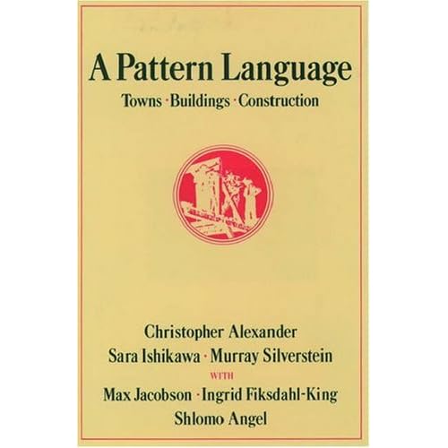
Christopher Alexander, architect and author of A Pattern Language, recently received the Vincent Scully Prize from the National Building Museum in Washington, DC.  The prize recognizes "exemplary practice, scholarship or criticism in architecture, historic preservation and urban design." They note that "for nearly 40 years [Alexander has] challenged the architectural establishment, sometimes uncomfortably, to pay attention to the human beings at the center of design."

He may well have challenged the architectural establishment, but the architectural establishment has largely ignored that challenge. The architectural theory taught in the major architectural schools largely ignores human beings and their needs. Witold Ryybczynski has a good analysis of this in his most recent Slate column.

I've long been a fan of Alexander for just this reason–he thinks about how we shape space around people and their needs. Every architect will say "of course the building is designed for the people who use it." But too often, the aesthetic "needs" of museum visitors trump their actual need for a place that is inspiring, but also welcoming, comfortable, and easy to navigate.

I have often thought it would be useful to assemble Alexander-style patterns for museum buildings, with a particular focus on visitors.  There are certainly already organizational tropes that we see everywhere, the store on the right at the exit being one of them, but real patterns would add a human dimension to museum design that often seems missing.

November 11, 2009

What is old is new again


Despite working in Boston for ten years, I had never been to the Harvard Museum of Natural History. I visited two weeks ago and what a treat it is, like a trip back to an earlier world of museums.  The museum doesn't ramble like the the American Museum of Natural History in New York, but despite its much smaller size it packs in almost as much experience.

Contemporary museum exhibit practice is to give artifacts lots of space.  This happens for lots of reasons–a desire to focus attention on the object, a design aesthetic that values negative space, and, sometimes, a paucity of worthwhile objects. This is not the case at Harvard's museum.  The place is stuffed with great stuff, as you can see in the photo of the mammal room where the poor giraffe must share airspace with the right whale.

Many of the labels are hand typed and often include just enough description to give the object a little context.  Unlike contemporary exhibits, where the narrative is clear and the messages direct, the simple taxonomic organization of most of the exhibits at Harvard lets visitors discover as they go. This is the best kind of constructivist learning; there is a constant sense of discovery.  I especially liked the on duck in a case full of extinct birds where, at the very end of the label, in small type, it said "this is perhaps one of the museum's greatest treasures."

It is difficult (and perhaps unwise) to glorify the "cabinet of curiosities" approach to museology as it must have gone out of fashion a hundred years ago, but here is an instance where the old ways may well inspire visitors better than the new.  Of course, few other museums have the richness and diversity of the Harvard collections and it is the quality of the specimens as well as their volume that creates the sense of wonder and discovery.


The recently renovated Natural History Museum in Paris (if 1994 is still recent) creates a similar effect with the centerpiece Grande Galerie de l'Evolution featuring dozens of mammals parading through the three story atrium. This contemporary exhibit inspires the same sense of wonder as the Harvard Museum. It is beautiful, but without at least a little bit of context, it seems empty, even meaningless.  Little typed labels would distract from the aesthetic, but they might enhance the sense of wonder.

The Harvard Museum of Natural History is a reminder that despite our desire that people come away from a museum visit having learned something, perhaps the one thing they learn is that they want to know more.

This was certainly the outcome for me. I picked up a copy of The Rarest of the Rare: the Stories Behind the Treasures of the Harvard Museum of Natural History, which is almost as wonderful as the museum itself. Interestingly, the Abraham Lincoln Museum in Springfield, Illinois has the same effect on people, despite having a paucity of artifacts.  The museum store keeps a pallet of Lincoln biographies in the center of the store. I bought one of those, too.

October 27, 2009

The End of an Epoch?

Nicolai Ouroussoff has an interesting piece in the NY Times. It is titled "An American Architectural Epoch Locks Its Doors," and would seem to be about the end of the era of architecturally exuberant public buildings. Not surprisingly given Ouroussoff's own longstanding exuberance for innovative architecture, the article turns out to be an subtle defense of such buildings.

Ouroussoff argues persuasively that a wide variety of architectural expressions can help to create a richer and more engaging city, especially if they are part of a larger, community-centered urban plan.  He cites Chicago's astonishingly successful Millennium Park as the prime example with its Gehry and Piano's buildings facing off across a park that has intimate connections to a city with a history of architectural innovation and diversity.


As usual, the failures are more instructive than the successes. He cites Dallas' ambitious arts district as a place that still has not succeeded, despite buildings by Foster, Koolhaas, Pei, and Barnes.  He says:
What the planners could not easily overcome was the scale of destruction [of the old neighborhoods], and the resistance many felt toward breaking down old barriers. Nearly 30 years after the plan was unveiled, most of the commercial lots remain empty. And the divisions that continue to separate this enclave of high culture from the nearby communities remain deep.
To Ousousoff the epoch that is over is not one of architecturally distinctive museums, but one where such buildings operate in isolation from their communities. He is convincing when he argues that we need to recognize that architecturally significant buildings must work together with the city's existing urban infrastructure, neighborhoods, and communities in order to succeed.

While subtly defending what some would call "starchitecture," Ourousoff also acknowledges that sometimes exuberant design goes wrong:
The problem with freedom, after all, is that it allows for horrifying imaginative failures as well as works of stunning genius. When artists fail, you can ignore their work. When architects fail, you walk by their buildings every morning on your way for coffee shaking your fist. (The Milwaukee and Denver art museums come to mind.)
Going for a dramatic design and getting it wrong is one risk that museum planners need to assess.
Almost as bad is to have successful design that doesn't fit the community, especially when the real new "epoch" of museum planning is one that is driven by community. As Ouroussoff reminds us, planners need to think well beyond the museum building itself and really understand how the building and its programming engage the neighborhood and serve the local community.